
Rofish

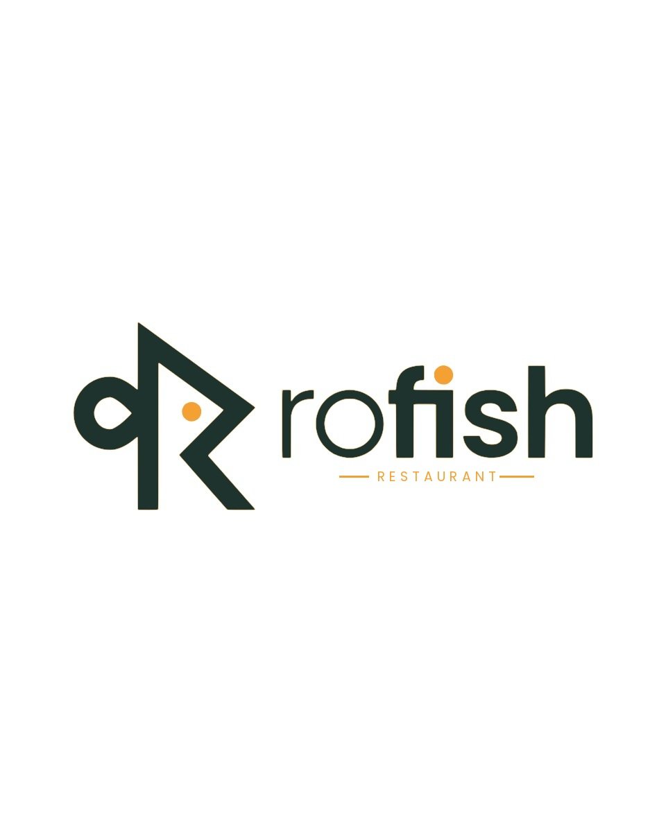
The letter R shaped into a fish, with an orange dot for its eye. A smart identity for a seafood restaurant, with mockups on an apron, a napkin, a cap and a round wall sign.
- Client
- Rofish
- Industry
- Seafood restaurant
- Services
- Logo design, mockup design
- Palette
Logo mockups
Five views that show how the logo looks in real use. Drag, swipe or use the arrows.

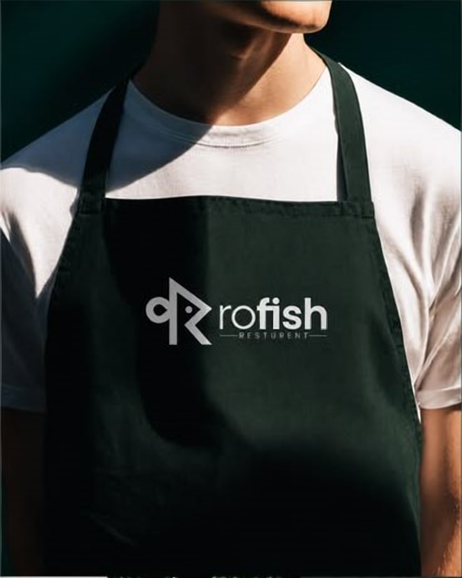
Apron mockup
The logo in white on a dark green chef's apron.
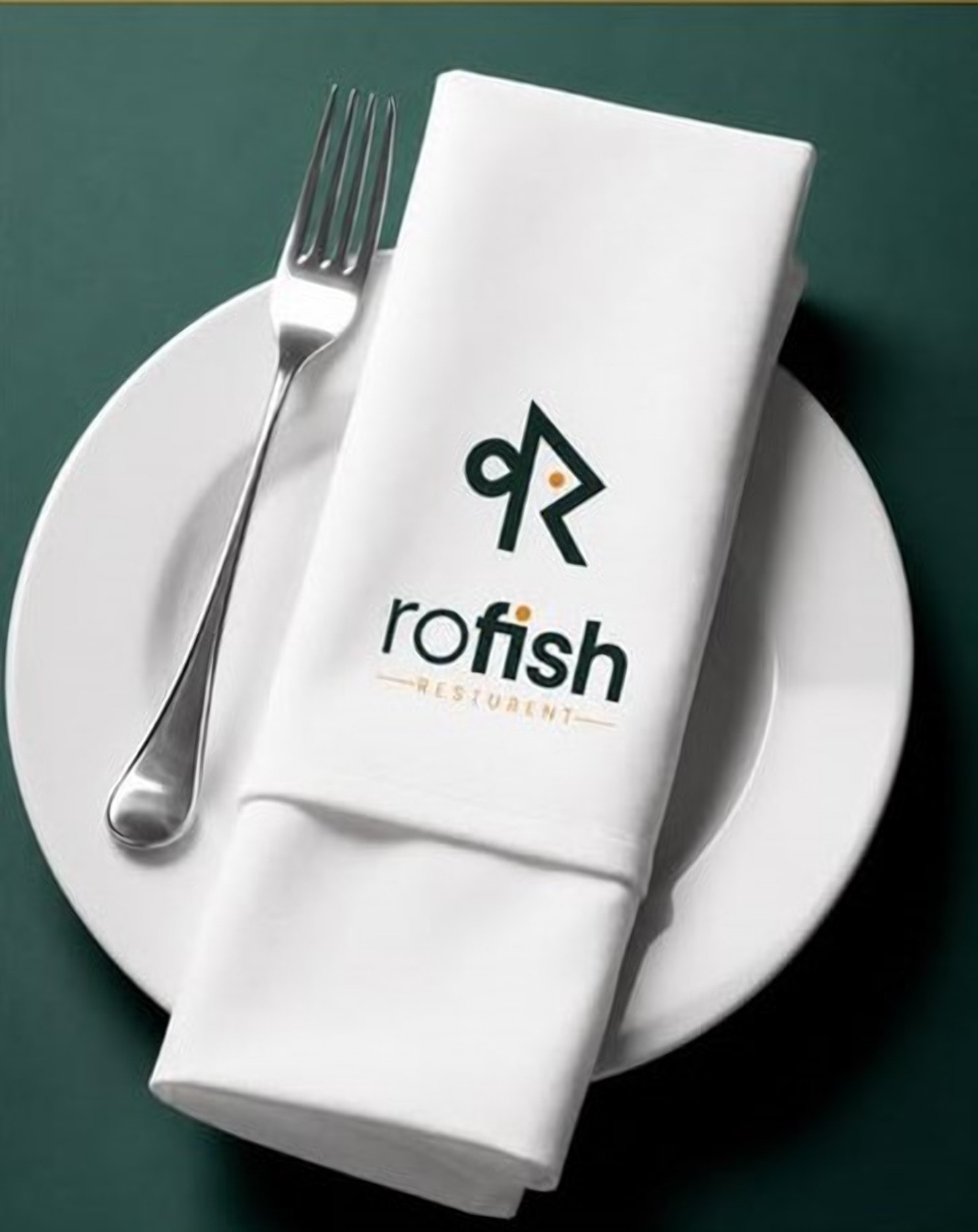
Napkin mockup
The stacked logo on a folded white napkin, set on a plate.
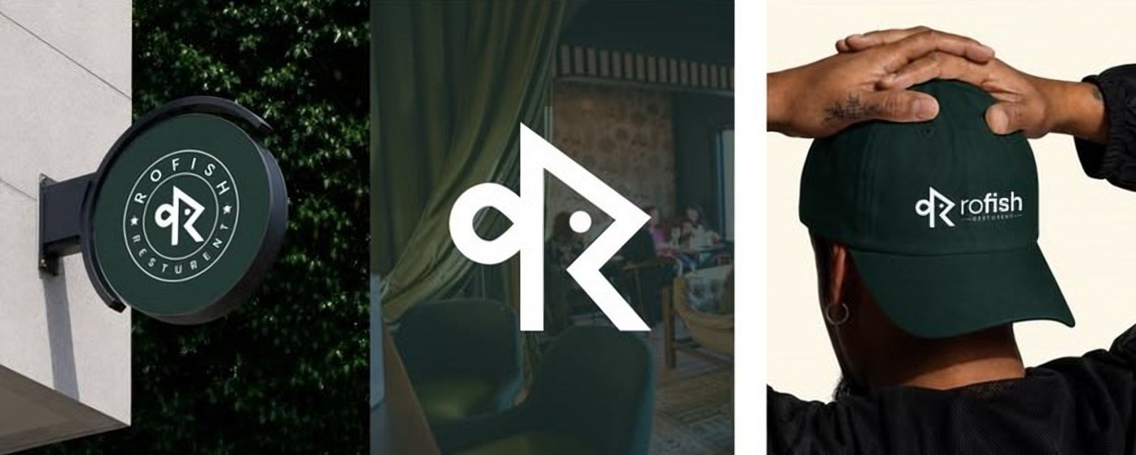
Sign and cap mockups
A round wall sign, the monogram on its own, and a green cap.
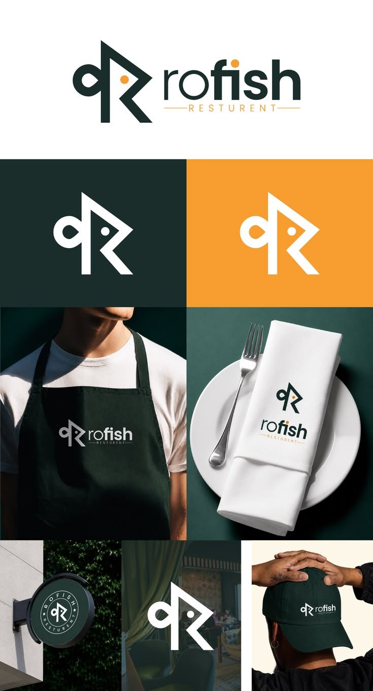
Brand sheet
The logo, the monogram on green and orange, and every mockup on one page.
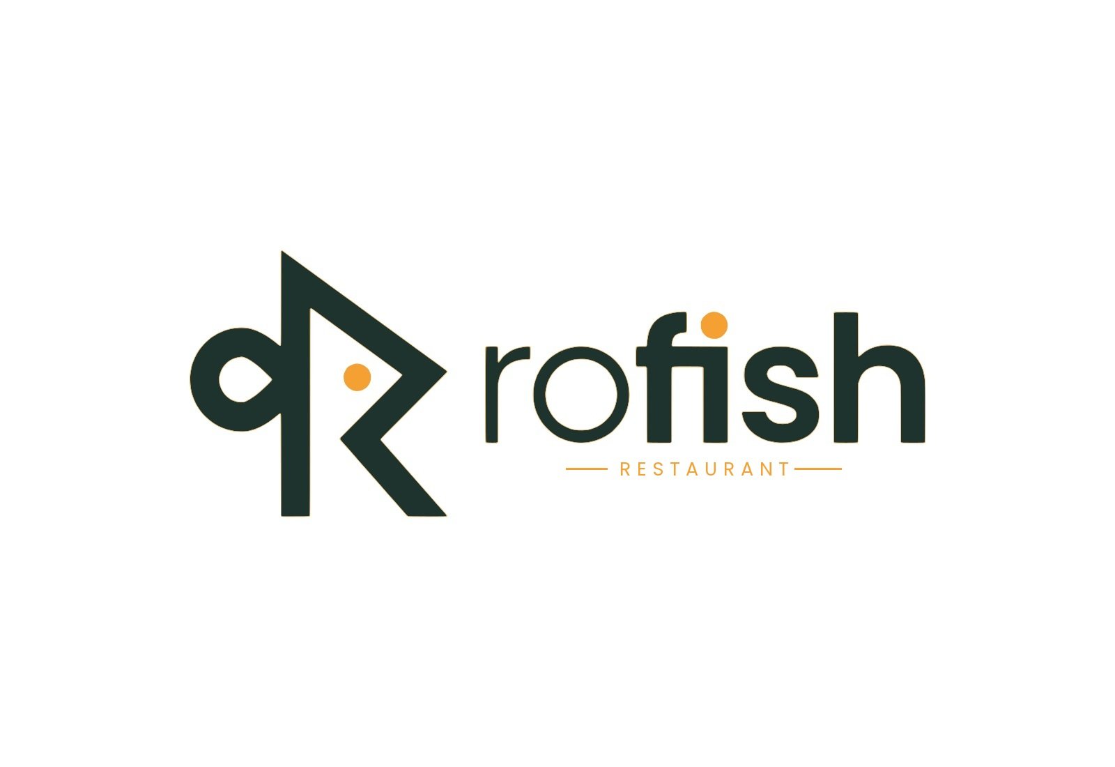
Primary logo
The R-fish monogram beside the rofish wordmark, with its orange eye.
Project overview
An R that swims.
Rofish is a seafood restaurant, so we shaped the R into a fish and gave it a single orange dot for an eye. The name and the food are told in one mark.
Dark green and warm orange give the brand a fresh, upscale dining feel, and the monogram works on its own on a cap, a napkin or a round sign.
- Mockups
- 5 views
- Brand colors
- 2 + white
- Year
- 2026
The brief, solved
What Rofish asked for, and how the identity answers it.
The challenge
Create a restaurant mark that people remember after one visit, and that works in one color on fabric, napkins and signage.
Our solution
- A clever R monogram that doubles as a fish
- An orange dot eye that ties the colors together
- Dark green and warm orange for an upscale dining feel
- Mockups on an apron, napkin, cap and wall sign, so the client could see the brand in the restaurant
More projects
Other brand identities from the Abeeras studio.
Want a brandlike this?
Tell us about your business and we'll design an identity that looks right everywhere it shows up.
Start a project