
Khan

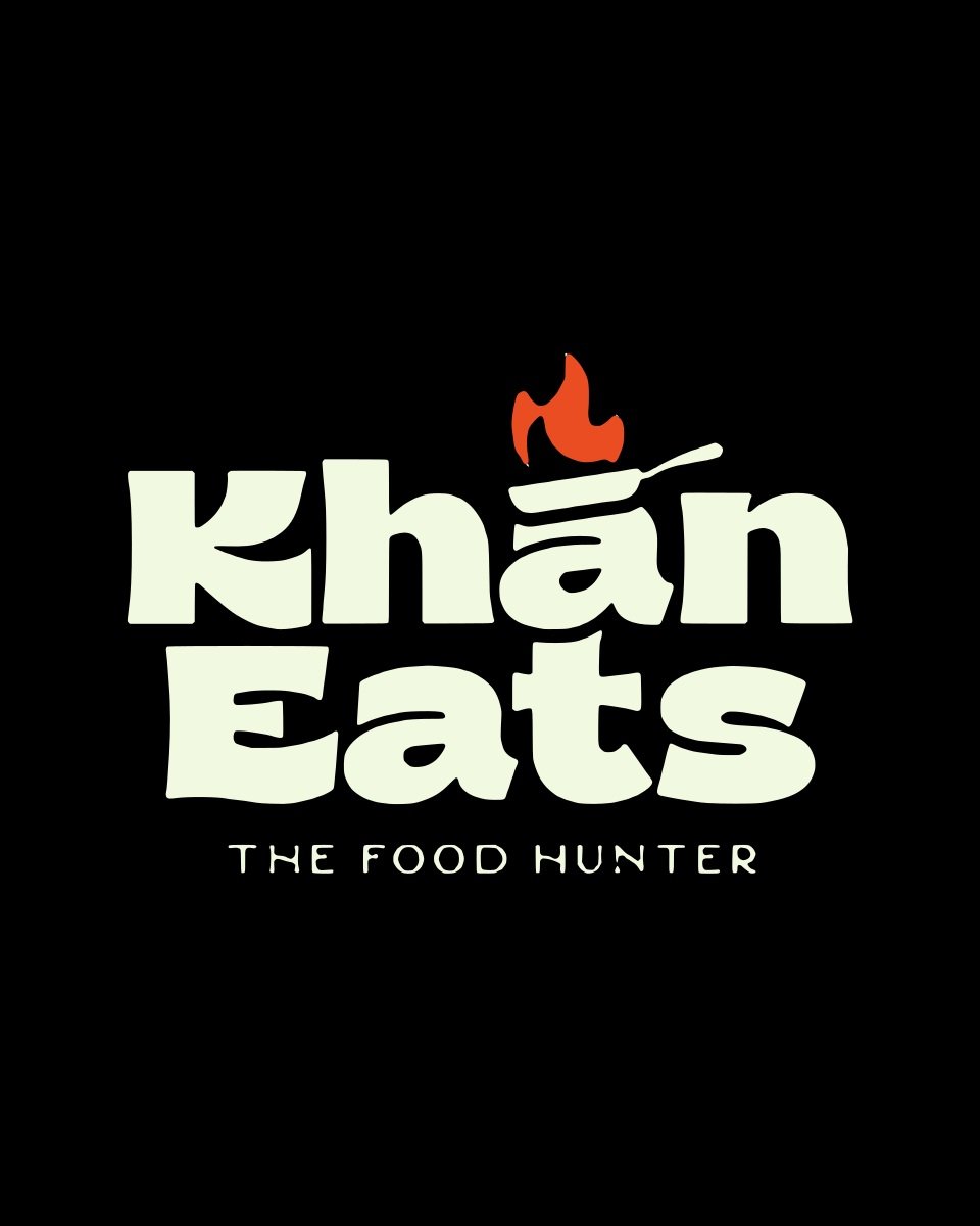
A flaming frying pan sits right on top of the lettering. A bold, flavorful identity for a food brand called The Food Hunter, with mockups on an apron, a takeaway bag and a serving board.
- Client
- Khan Eats
- Industry
- Food and restaurant
- Services
- Logo design, mockup design
- Palette
Logo mockups
Five views that show how the logo looks in real use. Drag, swipe or use the arrows.

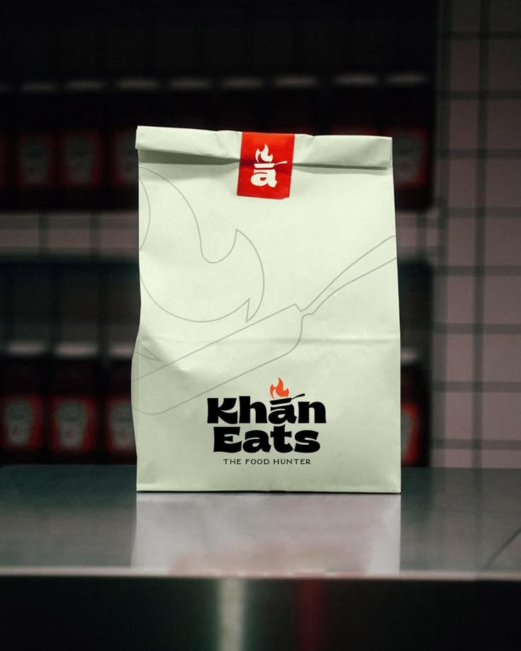
Takeaway bag mockup
A cream takeaway bag with the logo and a red sticker seal.
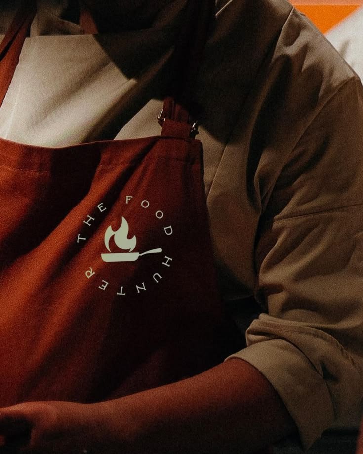
Apron mockup
A round badge version of the logo on a rust-red apron.
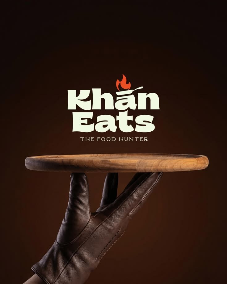
Serving board mockup
The full logo over a wooden serving board, styled like an ad.
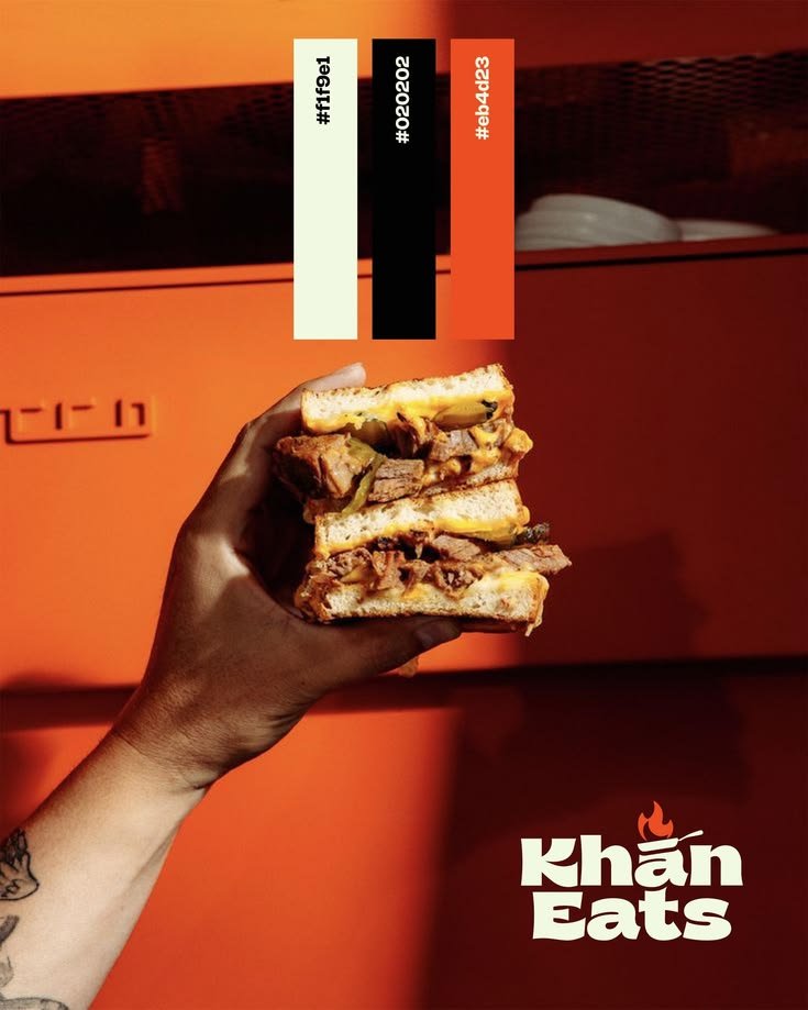
Color palette
Cream, black and fiery red, shown with the food the brand serves.
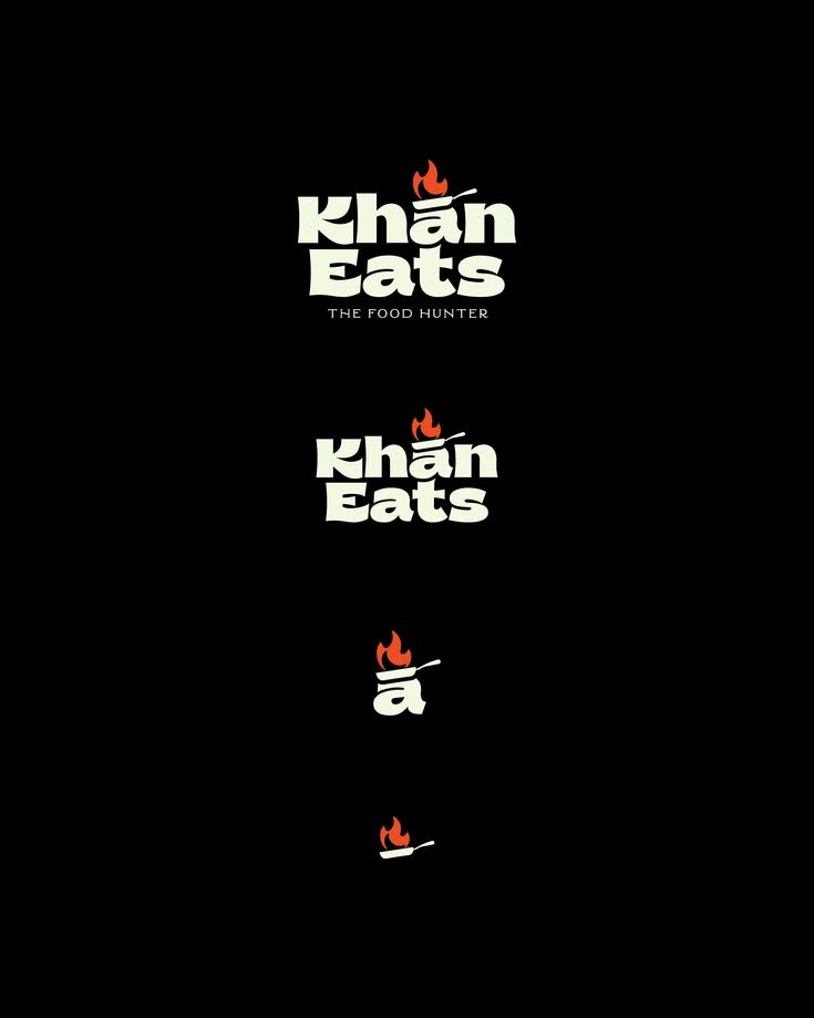
Logo system
Full logo, short logo, the ā icon and the pan icon, from big to small.
Project overview
A pan on fire, right above the name.
Khan Eats is a food brand built around flavor and heat, so we set a flaming frying pan on top of the lettering and let the bold, rounded letters feel as hearty as the food.
The logo comes as a system: a full version with the tagline, a short version, a single-letter icon and the pan alone, so it works from a shop sign to a sticker.
- Logo versions
- 4 sizes
- Brand colors
- 3
- Year
- 2026
The brief, solved
What Khan Eats asked for, and how the identity answers it.
The challenge
Give a food brand a personality people remember, with a logo that works as a big sign and as a tiny sticker on a takeaway bag.
Our solution
- A flame-and-pan icon built right into the wordmark
- A flexible logo system: full, short, ā icon and pan icon
- A cream, black and fiery red palette that matches the food
- Mockups on an apron, a takeaway bag and a serving board, so the client could see the logo in use
More projects
Other brand identities from the Abeeras studio.
Want a brandlike this?
Tell us about your business and we'll design an identity that looks right everywhere it shows up.
Start a project