Leaf Nest

All projects Brand identity, 2026

Leaf

Leaf Nest logo

Leaves fold together into the shape of a home, with a small window at the center. A clean eco-homes identity that combines a house, a leaf and a location pin in one mark.

Client
Leaf Nest
Industry
Eco-friendly real estate
Services
Logo design, mockup design
Palette
Logo designLogo gridLight versionDark versionBrand sheetMockup design

Project overview

Logo designBrand identityMockup design

A house, a leaf and a location pin. All in one mark.

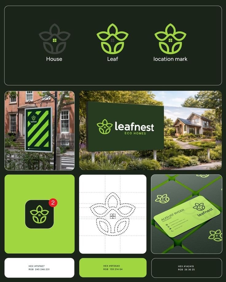
Leaf Nest builds eco-friendly homes, so the brand had to feel natural and still say home and place. We drew leaves that wrap together into a house shape, with a small window at its heart and a pin-like base.

The mark is built on a clear grid, so it stays balanced at any size, and the lime and forest green palette feels fresh without looking cheap.

Ideas
3 in one
Brand colors
2 + light
Year
2026

The brief, solved

What Leaf Nest asked for, and how the identity answers it.

The challenge

Create a mark that says nature and home at the same time, feels trustworthy for buyers, and stays simple enough for an app icon.

Our solution

  • Leaves that form a house, with a window at the center
  • A shape that also reads as a location pin
  • A clear construction grid for balance at any size
  • Light and dark versions, plus a brand sheet showing the logo in use

Want a brandlike this?

Tell us about your business and we'll design an identity that looks right everywhere it shows up.

Start a project
Next project Khan Eats
Prev
Next
cart (0 items)
Select the fields to be shown. Others will be hidden. Drag and drop to rearrange the order.
  • Image
  • SKU
  • Rating
  • Price
  • Stock
  • Availability
  • Add to cart
  • Description
  • Content
  • Weight
  • Dimensions
  • Additional information
Click outside to hide the comparison bar
Compare